Last weekend I took seven Uber rides. Five times, the app hit me with a UI trick I hadn’t fully clocked. Two times, I tapped the wrong button and tipped a driver I hadn’t planned to tip — not because I’m careless, but because Uber designed it that way.
The actual trick: a button that silently changes
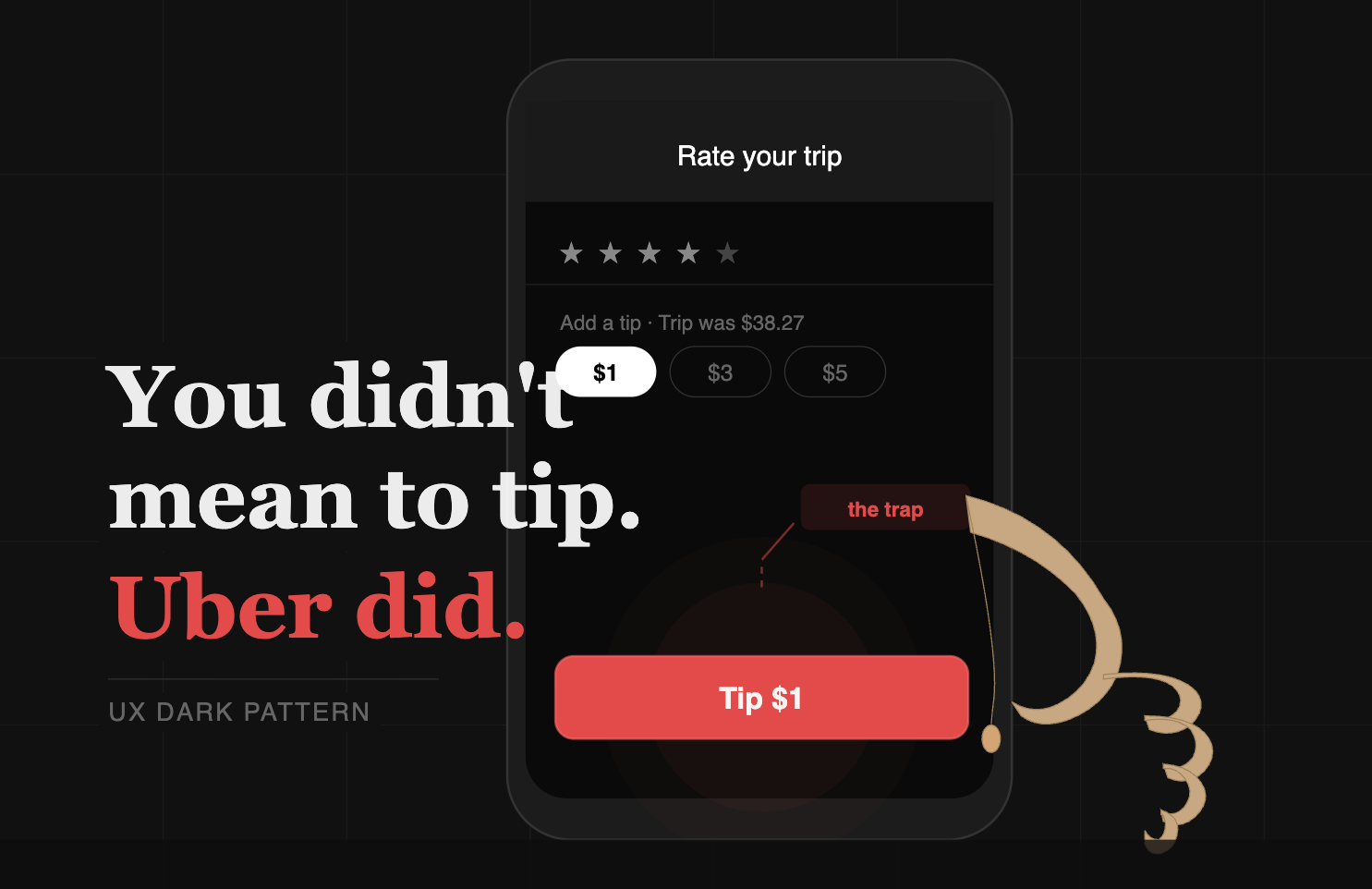
This is more subtle than a misleading label. After rating your driver, Uber shows a tipping screen with preset amounts — $1, $3, $5. One amount is pre-selected by default. And here’s the key: when a tip amount is selected, the bottom button doesn’t say “Submit.” It says “Tip $1.” There is no Submit button visible at that moment. To get a neutral submit, you’d have to actively deselect the pre-chosen tip first.

The critical insight: “Submit” is not the default. It only appears if you take an active step to remove the pre-selected tip. Most users never know that step exists. They just see a big button at the bottom of the screen and tap it — the same way they’ve tapped the primary button on every rating screen, checkout flow, and form in their lives.
“The default state of the screen is already a payment. You’re not asked if you want to tip — you’re asked to opt out of tipping you’ve already implicitly agreed to.”
The three layers of manipulation
01
Pre-selection as consent
Choosing a default tip amount and requiring users to deselect it treats inaction as agreement. This is a textbook roach motel — easy to get in, non-obvious to get out.
02
Muscle memory exploitation
Every checkout, form, and rating screen trained your thumb to tap the big bottom button to finish. Uber intercepts that reflex and turns it into a $1–$5 charge before you’ve registered what you tapped.
03
Hidden opt-out
There’s no visible “no tip” option — you have to deselect an already-highlighted button to reveal the neutral submit. The path of least resistance is always the paid one.
Why this matters beyond a few dollars
The tip amount is small. But multiply one accidental $1 tip across millions of daily rides and you have a revenue stream built entirely on user inattention. Drivers deserve tips, no doubt. The important question here is whether a company should profit from engineering confusion into a UI?
What ethical design looks like: show tip options with nothing pre-selected, keep the submit button always visible and clearly labeled, and let users choose deliberately. The current design fails that standard on every count.
Credits: I forgot to take photos during my rides, so I relied on a Redditor who experienced something similar for recreating images to better explain the UX dark pattern.
Get freshly brewed hot takes on Product and Investing directly to your inbox!
Leave a Reply