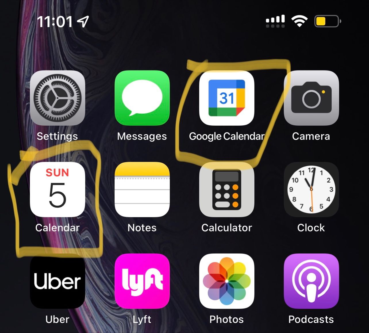
Product Insight of the week: As I was trying to fill out a form, I pulled out my phone to confirm the date.
I noticed how the default calendar app on iPhone has used the dynamic icon to provide me exactly the information I needed. It tells me today is Sunday June 5. On the other hand, calendars which use a static icon fails to capture that useful info.
Similarly, the Clock app displays the time in the icon itself to avoid another click just to get the most used information.
Wondering why don’t all apps utilize dynamic icons to display the *most* used feature in the app? For example, Uber can display the time to the nearest driver. Something like, “Ride in 4 mins with Uber X”. It may require constant data fetching but also save users another click!
Get freshly brewed hot takes on Product and Investing directly to your inbox!

